Every design below sits on the same 12oz sleek can with the same system, so a property can choose a direction and have print-ready art back without starting from a blank page. Prefer your own brand on the can? That is what most clients do; these show how far the can can travel.
Request a quote & mockupThree outlined drops, drawn like a pen stroke. An M above, a W within.
MEANING WATER on one line, with STILL or SPARKLING SPRING WATER beneath.
A QR code to your menu or property page, and meaningwater.com.
12oz sleek, matte finish, infinitely recyclable aluminum. 16oz Standard on request.
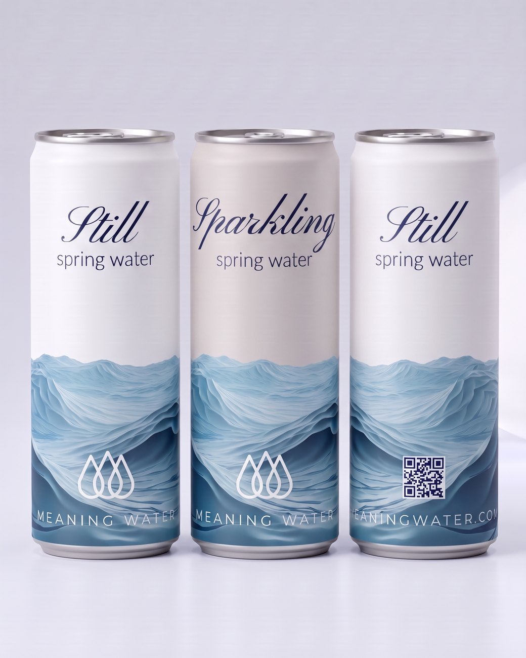
The house can. A painted wave band sits low on a matte can, the script word at the top, the mark and MEANING WATER beneath. The Still can is white, the Sparkling can a soft grey, so the two read apart from across a table.
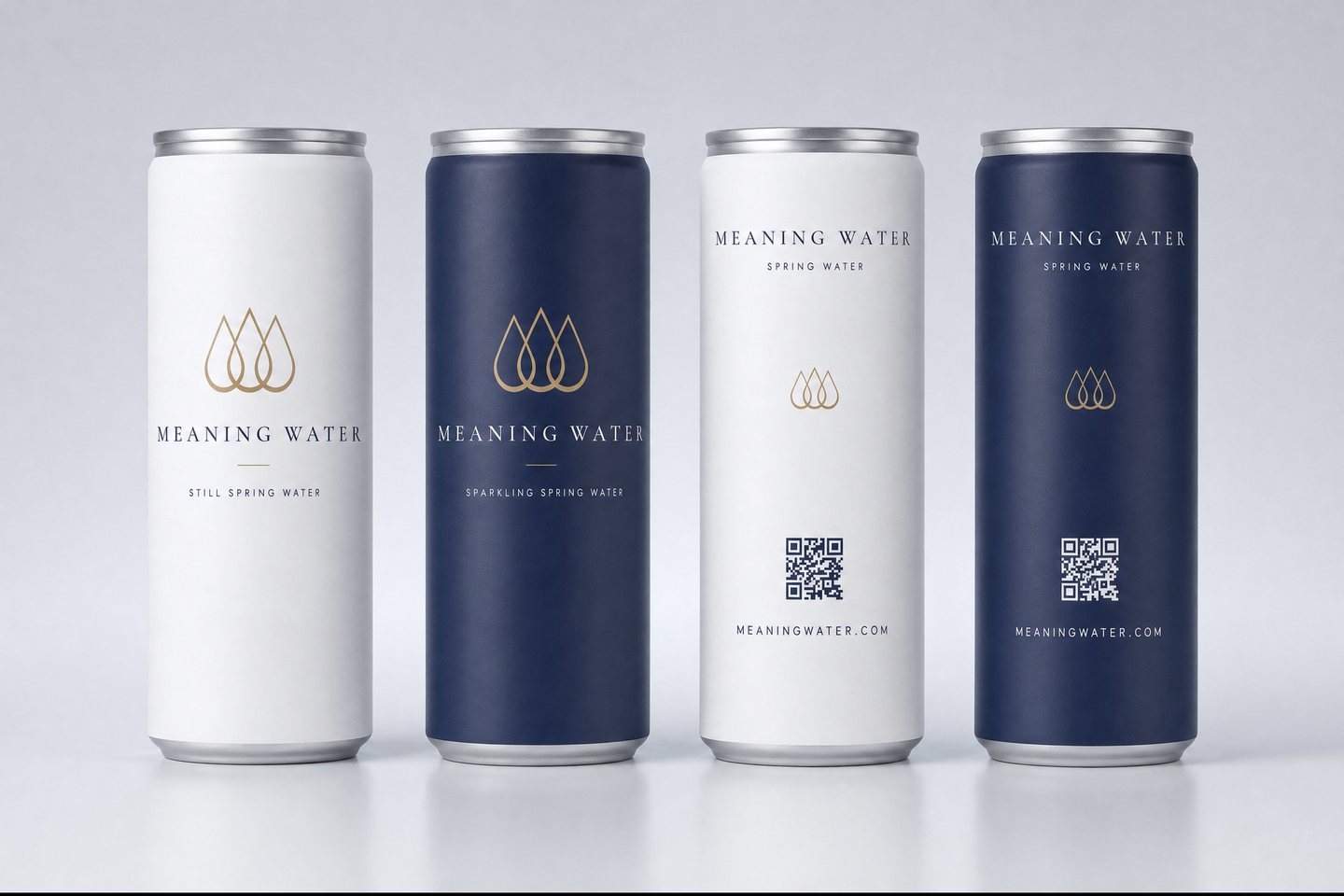
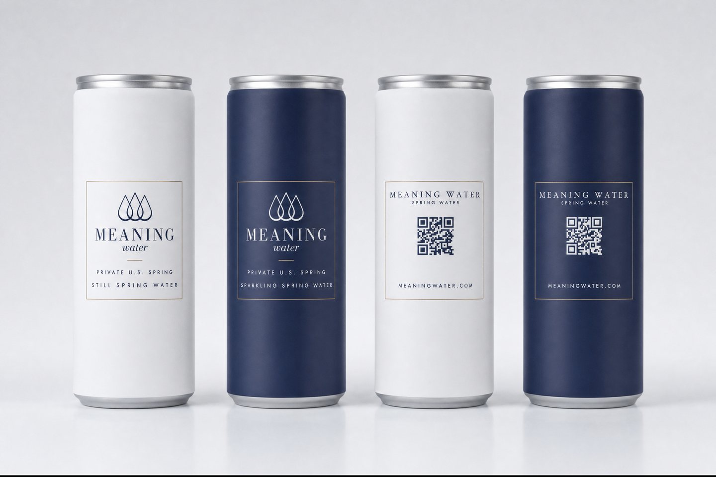
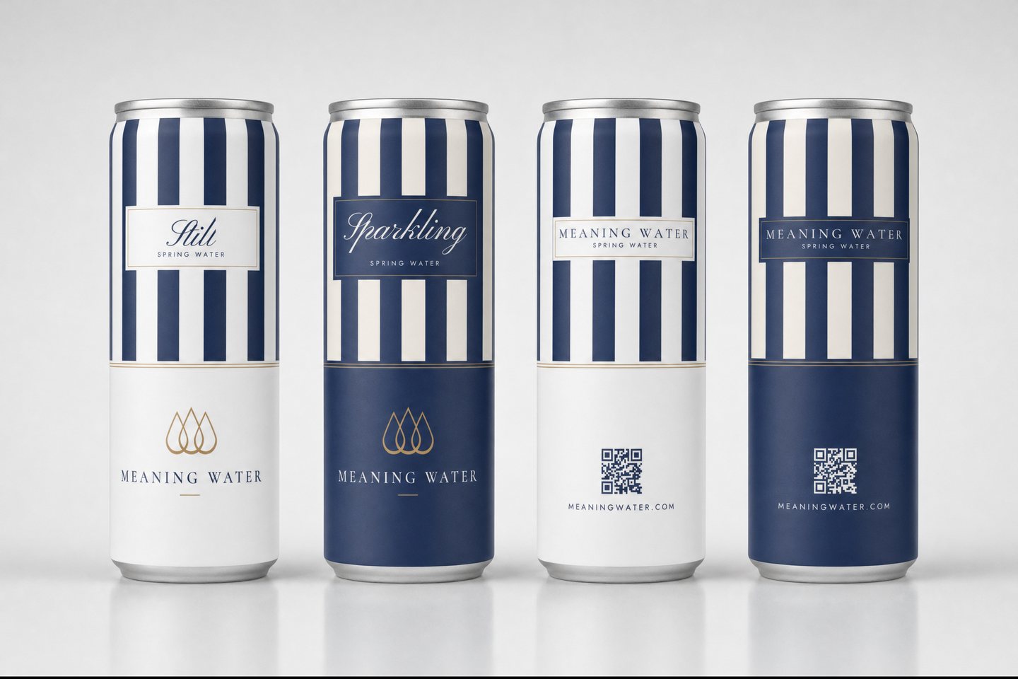
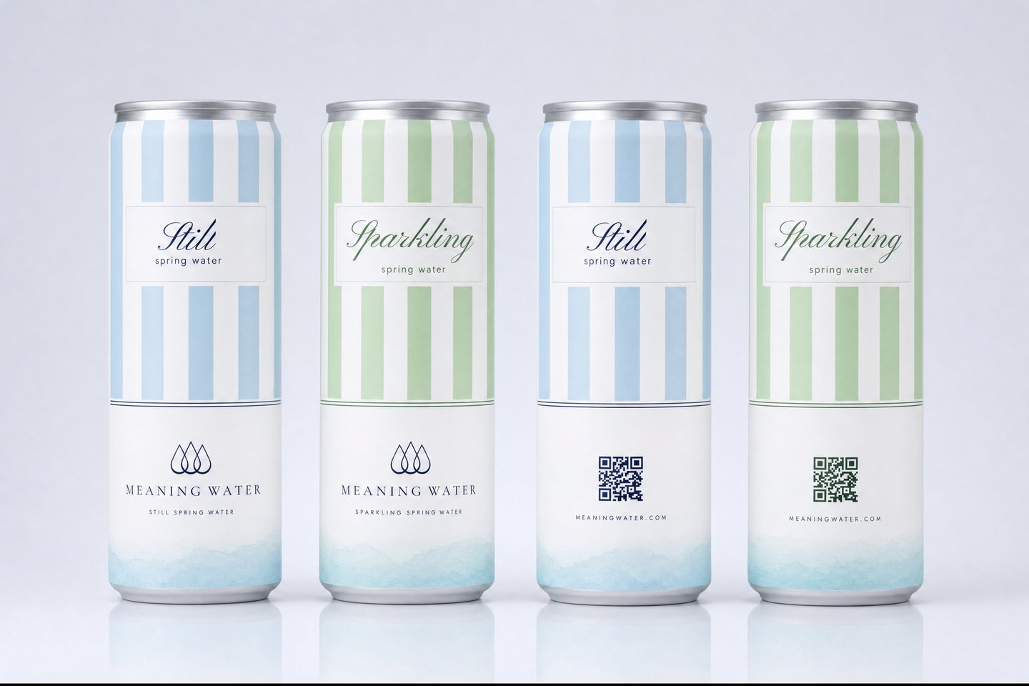
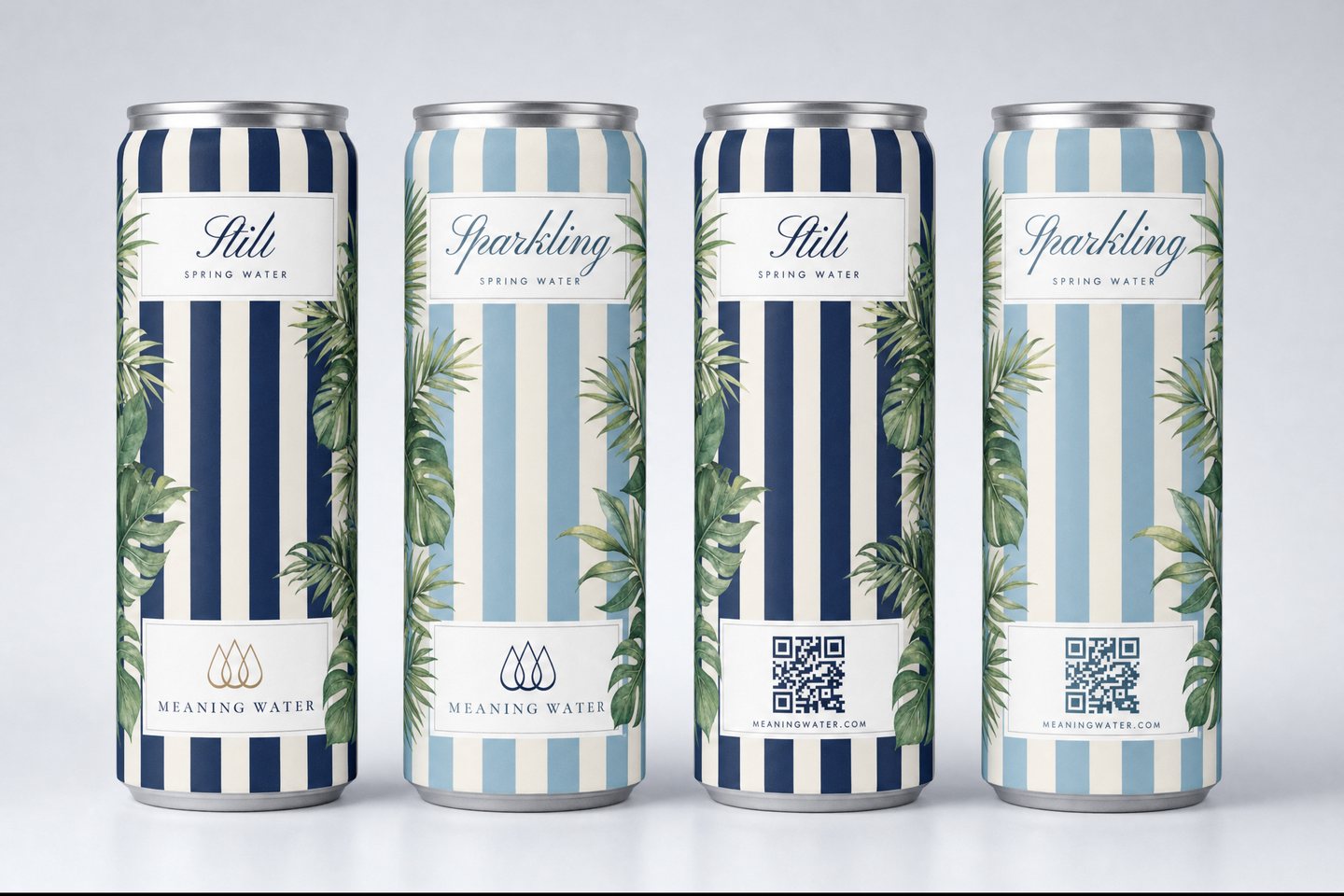
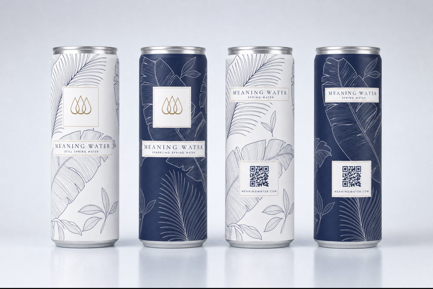
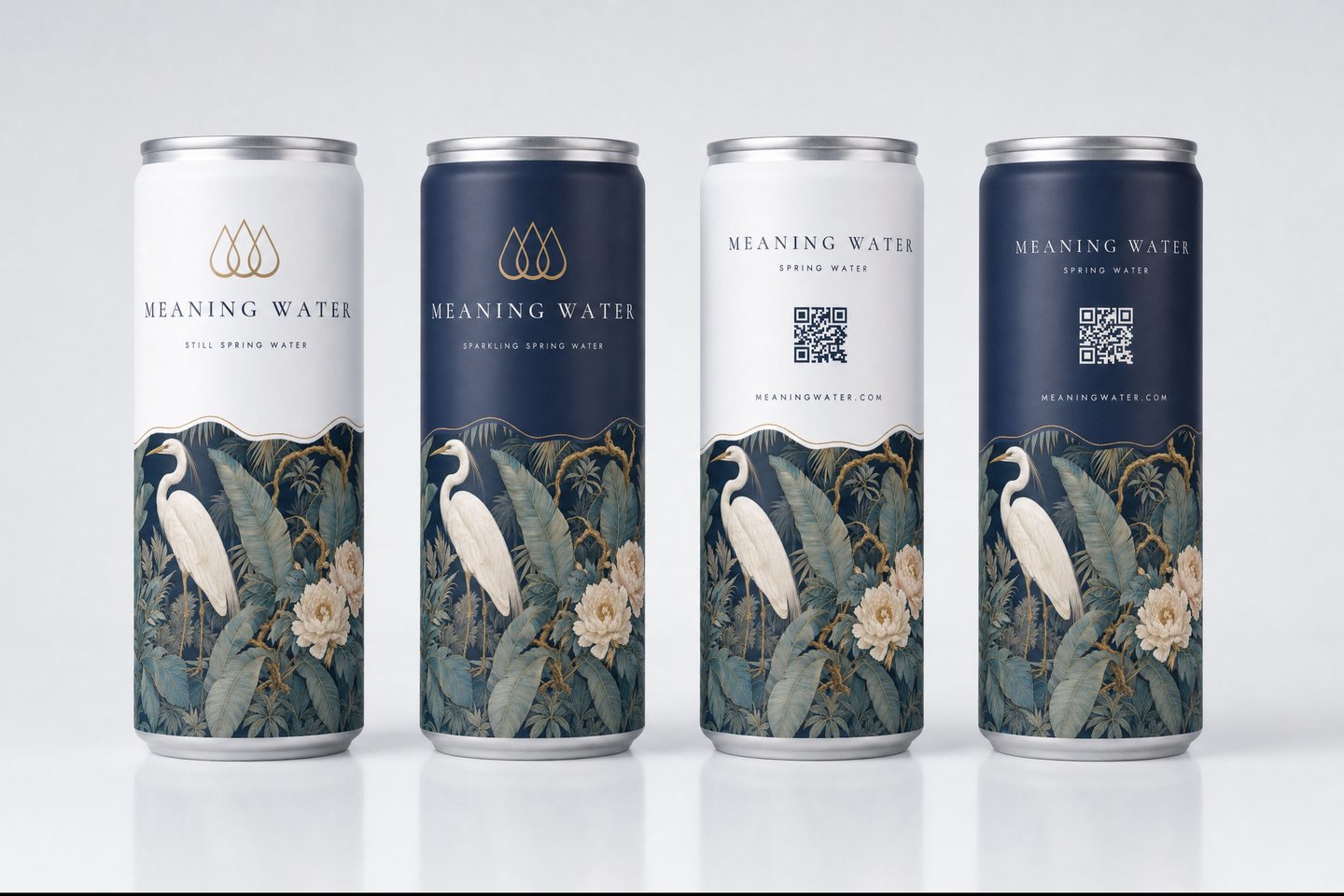
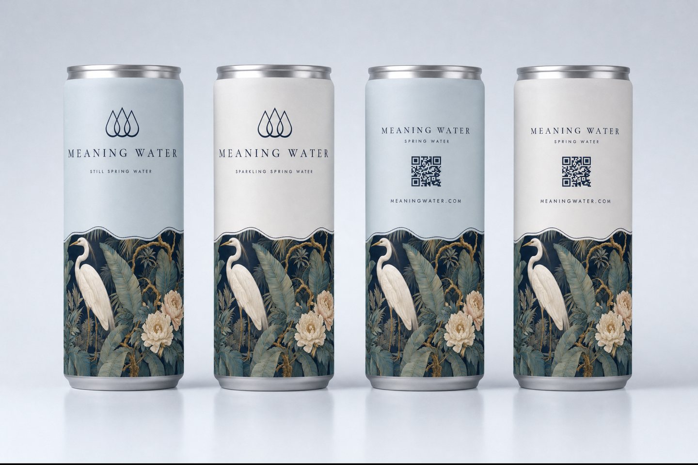
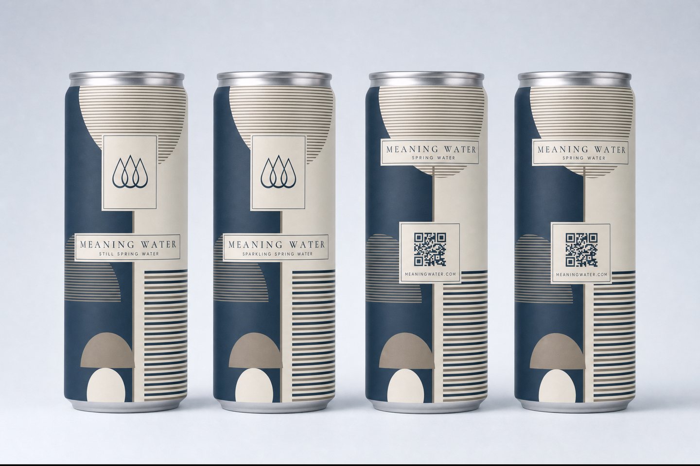
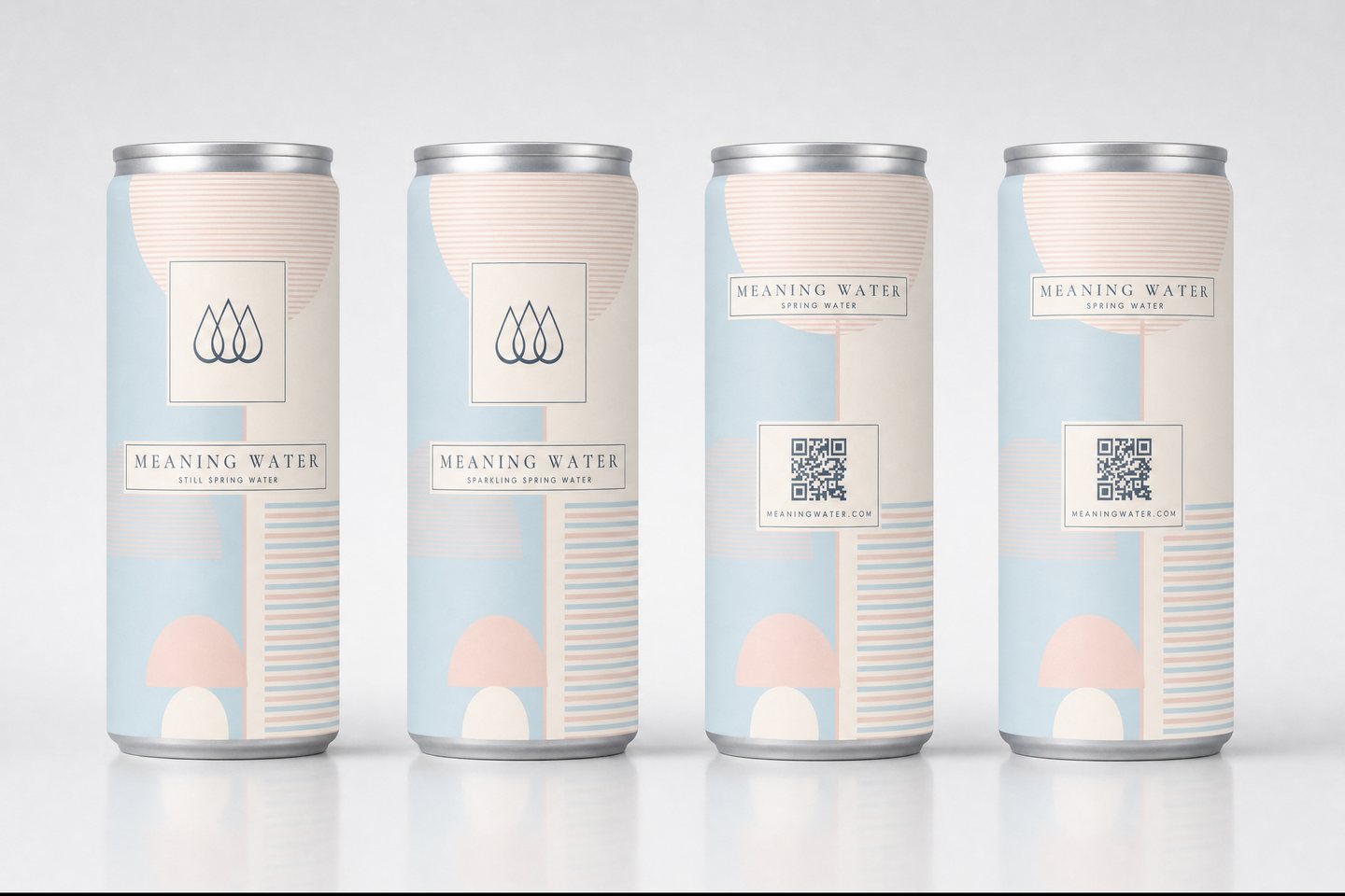
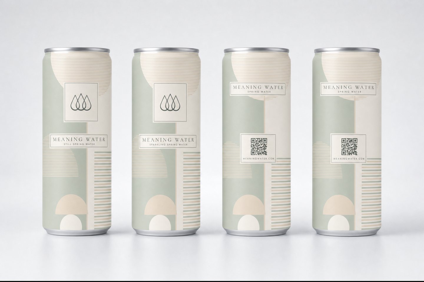
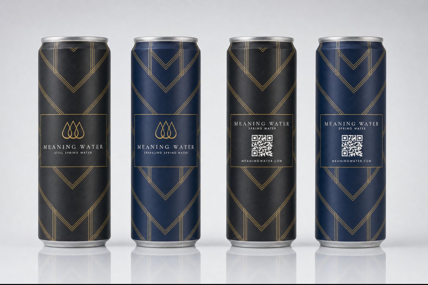
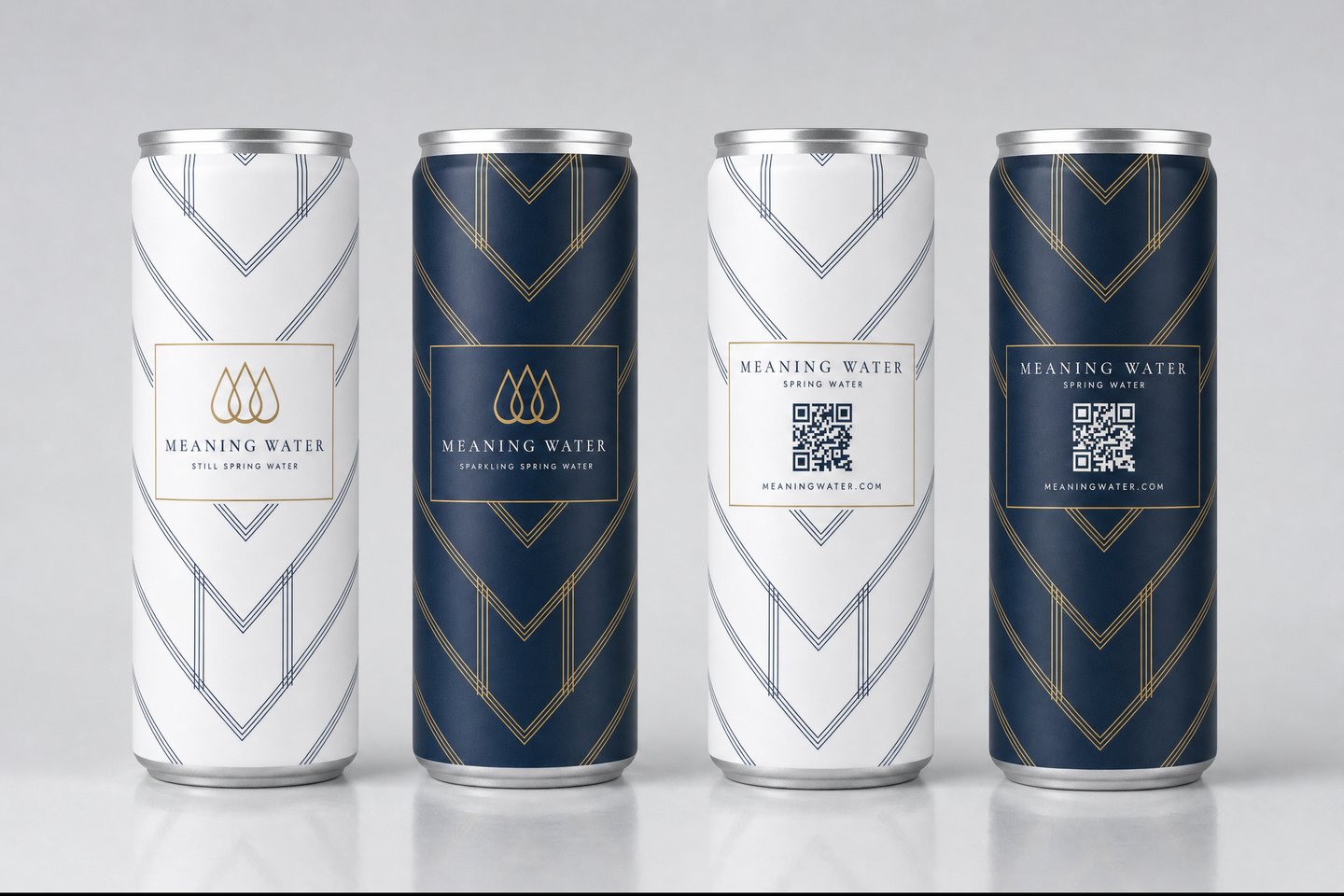
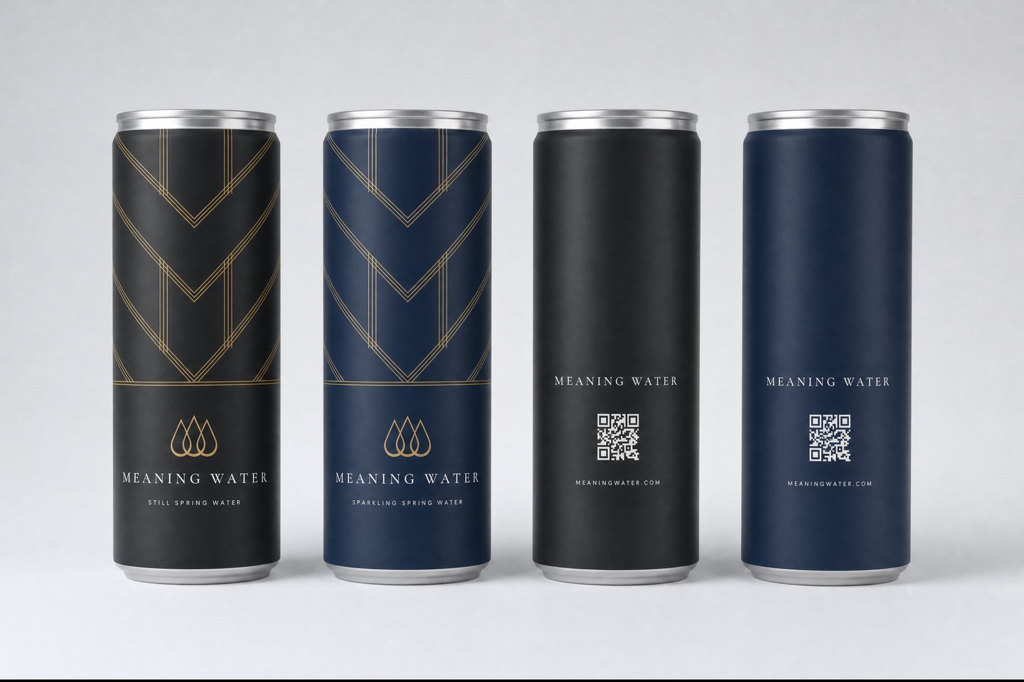
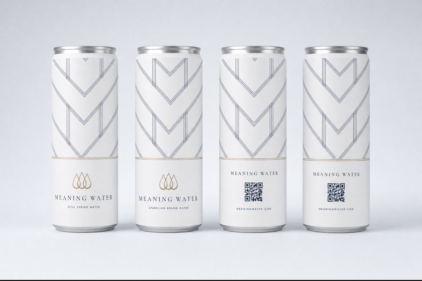
Renders are concept mockups built from flat artwork. The chosen direction is refined and vectorised for print, with print-ready files on the 12oz sleek dieline.
Tell us the property and the direction you like and we return a branded mockup and delivered pricing.
Request a quote & mockup →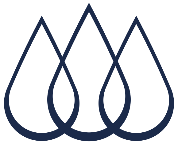 MEANING WATER